Design thinking for our zero-code edge AI platform
We started our journey building portable machine learning containers for edge devices. In the beginning, it was a command line interface. We got far with this, including having our first hackathon on using CLI tools for building on-device ML. We realized to bring the next million developers to build on-device machine learning, we had to build tools that every engineer could understand and learn quickly. On-device ML requires mastery over three (somewhat) disjoint domains:
machine learning
embedded computing
application development.
Hidden with all of this is also the needs of infrastructure and DevOps which is not easy.
To re-imagine the next generation of accessible on-device ML platform looks and feels like, we had to rethink what a developer with any background could do with the right tools. We built Hammer Forge Studio, our SaaS platform for any developer to build, test, deploy, and monitor on-device ML in minutes.
In this post, we want to talk about how critical the design thinking and process was leading up to the launch.
Art and design
We want to create no-code developing tools that allow our users to create apps that are fresh and at the forefront of edge computing. In our effort to increase UX-friendly features and improve our design, we have deployed the Glassmorphism and Flat design styles to achieve our goal. This post will expand on both designs and what it means for our foray into the future of making easy-to-use developer tools. It is about bringing accessibility and simplicity to modern development.
Glass Morphism on Hammer Forge Studio
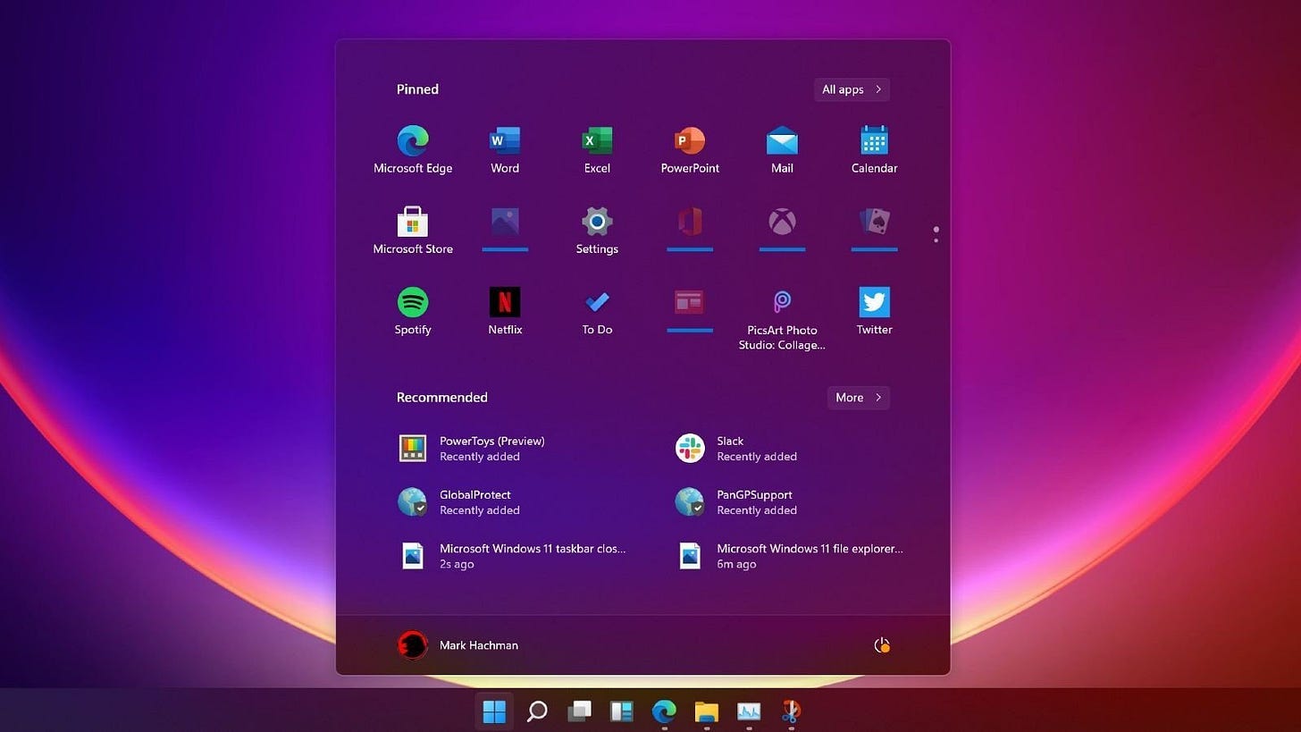
Glass-Morphism is a catchall term for a design aesthetic that you may have encountered before. It has a “frosted glass” feel and makes the product look fresher. This is important when you are trying to create the next generation of modern development. Users need to encounter something that is new to them. You may have seen this design used on the iOS’ pull-down menu. The effect and look of the design make the user experience feel fluid and responsive. When they open a new menu on top of an older one, they can still see the original menu behind the “frosted glass”. Doing so creates an element of cohesion, preventing users from feeling lost or disjointed from their main interface. Moving between menus feels modern, but then there is the element of staying accessible and consistent delivery to most users.
You can see that in the two examples below with windows and iOS.
Glass Morphism Design on Microsoft Windows 11
IOS 15.3.1 highly blurred Glass-Morphism Menu
Making it accessible
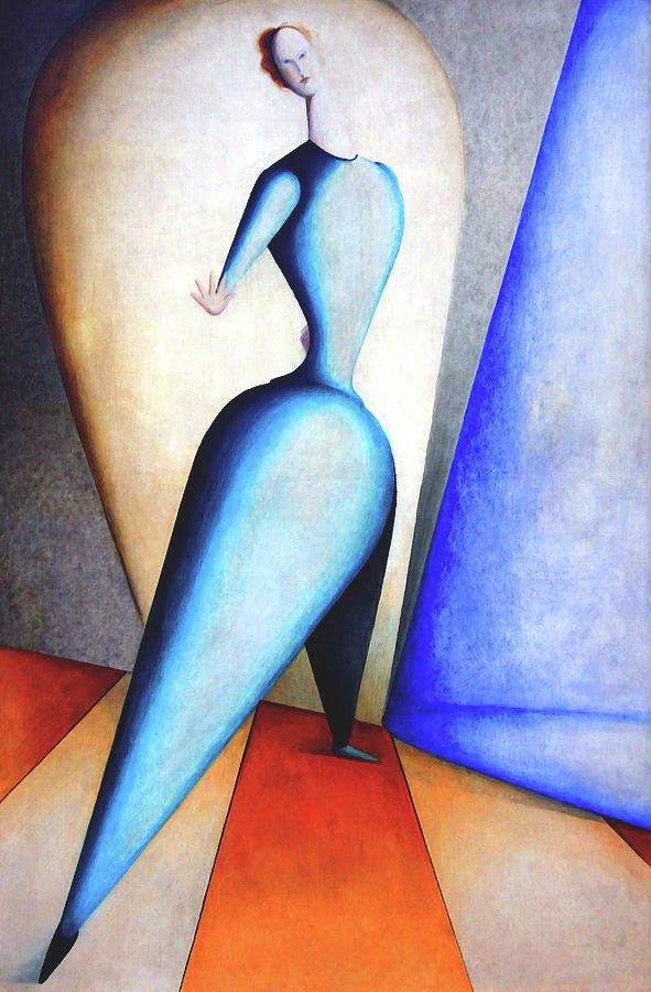
Accessibility and UI that is easy to grasp is at the heart of our design mission. This is why we couple our use of Glass-Morphism with elements of Flat design. It is a much older term than Glass-Morphism as it originated in the Bauhaus era of design in the 1930s.
Oskar Schlemmer (4 September 1888 – 13 April 1943) Bauhaus Design Area - Dancer
Ushering an age of modernism and efficiency, while keeping things clean and simple. Flat design utilizes a minimalist approach with flat menus and colors to streamline the user experience. This way, the user never feels lost in menus or while they are building a new app within our simple drag-and-drop builder. Therefore, this creates the main element of our design challenge. Enabling users to create on-device machine learning apps by only dragging and dropping components while conserving a futuristic feel yet keeping things simple.
Sample of Design System Development - based on Flat-Design Inspirations
We have succeeded in creating a design that feels futuristic while still being approachable and easy to use. Utilizing simplicity in design and manifesting it, we have achieved the look and feel while not losing functionality. When it comes to delivering edge computing developer tools, the front-end can often be neglected. However, the user experience and interface are just as important. The combination of Glass-Morphism and Flat design has allowed for the ideal mix of capable and accessible. You want tools that can do impressive things, but you also want them to be easy to use. We have succeeded, using this combo. The future is in no-code computing!
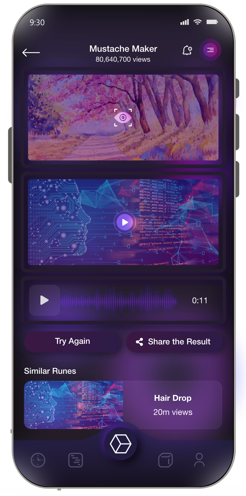
Runic mobile app also carries over the same design aesthetics
Now, you can also build your next idea using on-device ML using studio. Studio lets you drag and drop using out of the box models to build fully featured apps. Try it at https://studio.hotg.ai or share the link with any application developer that might find it useful!


